
Löfbergs
Packaging design / Branding
2024
Löfbergs is Sweden’s best-selling coffee brand and has been much loved since its foundation in 1906. Over the course of these many decades, the family-run business has seen several changes to its packaging design. And now the time has come again. Goldstorm proudly presents a bold new, colourful and confident look for 2024 and beyond!
Client: Löfbergs
Pictures: Marcus Avegren, Hayri Er & Goldstorm

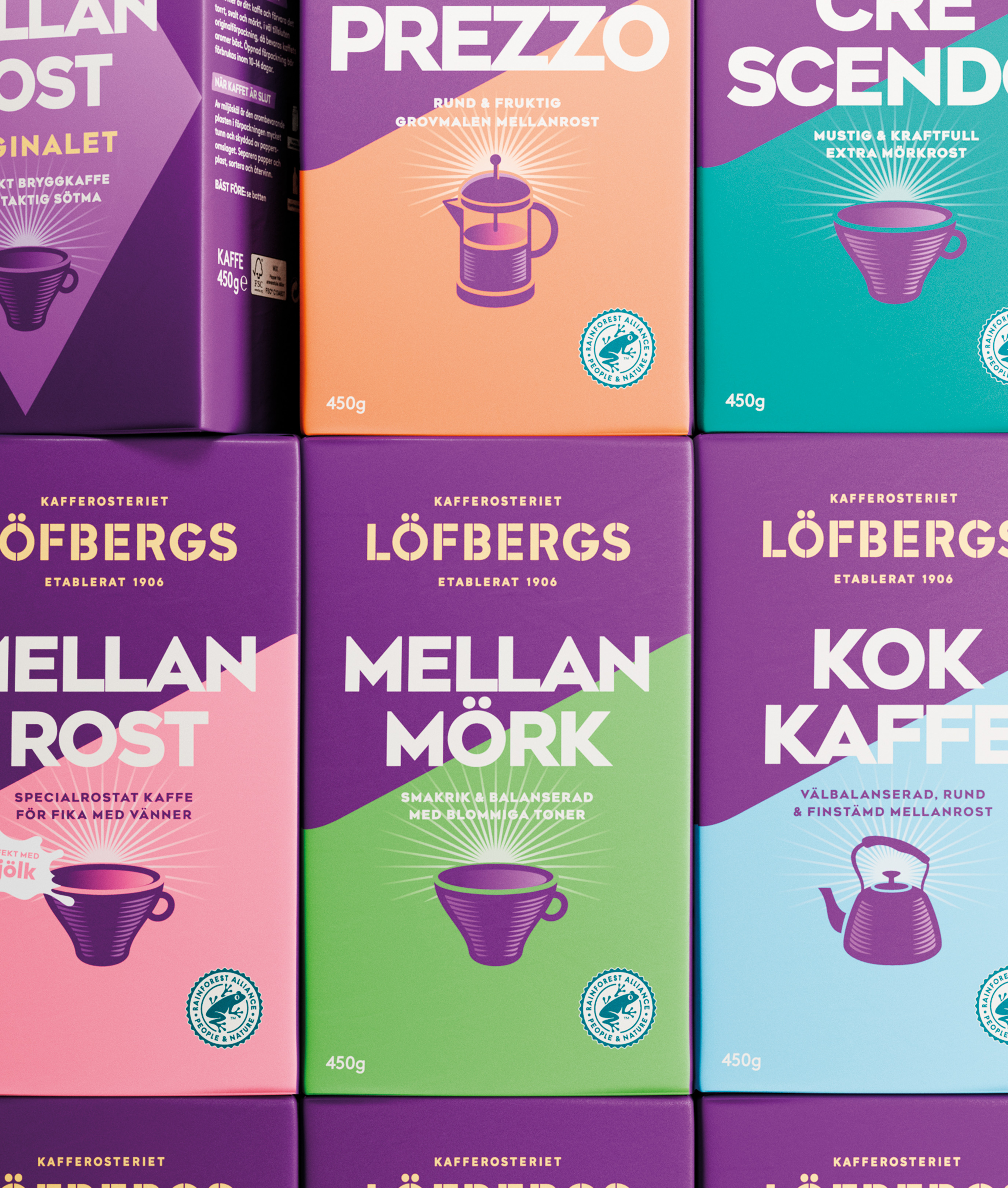

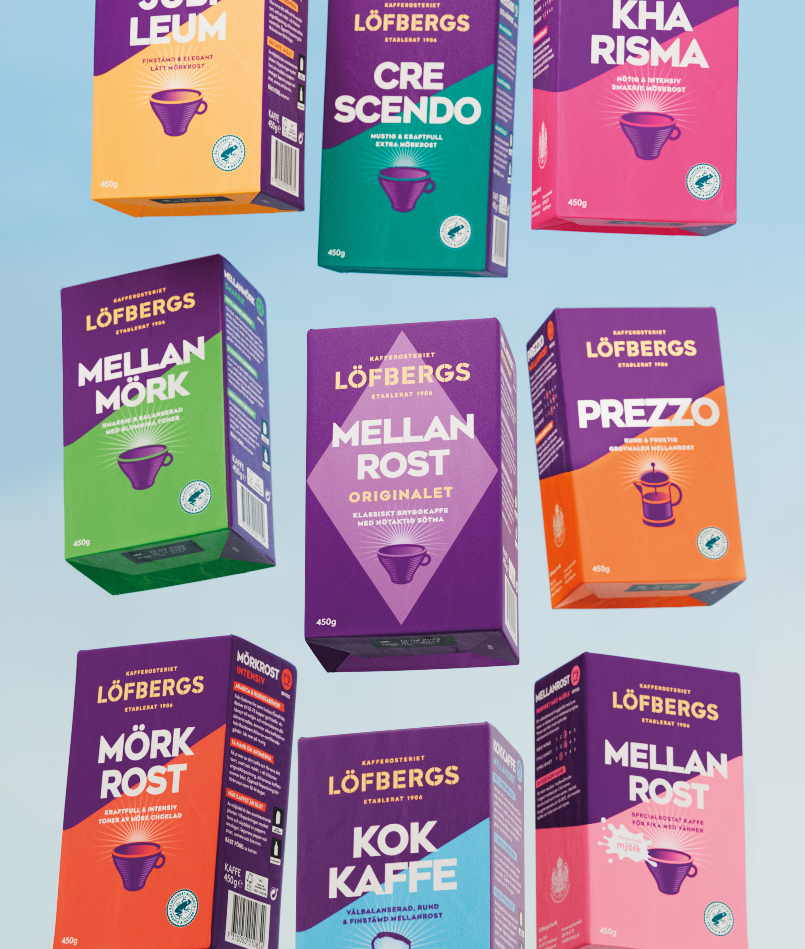
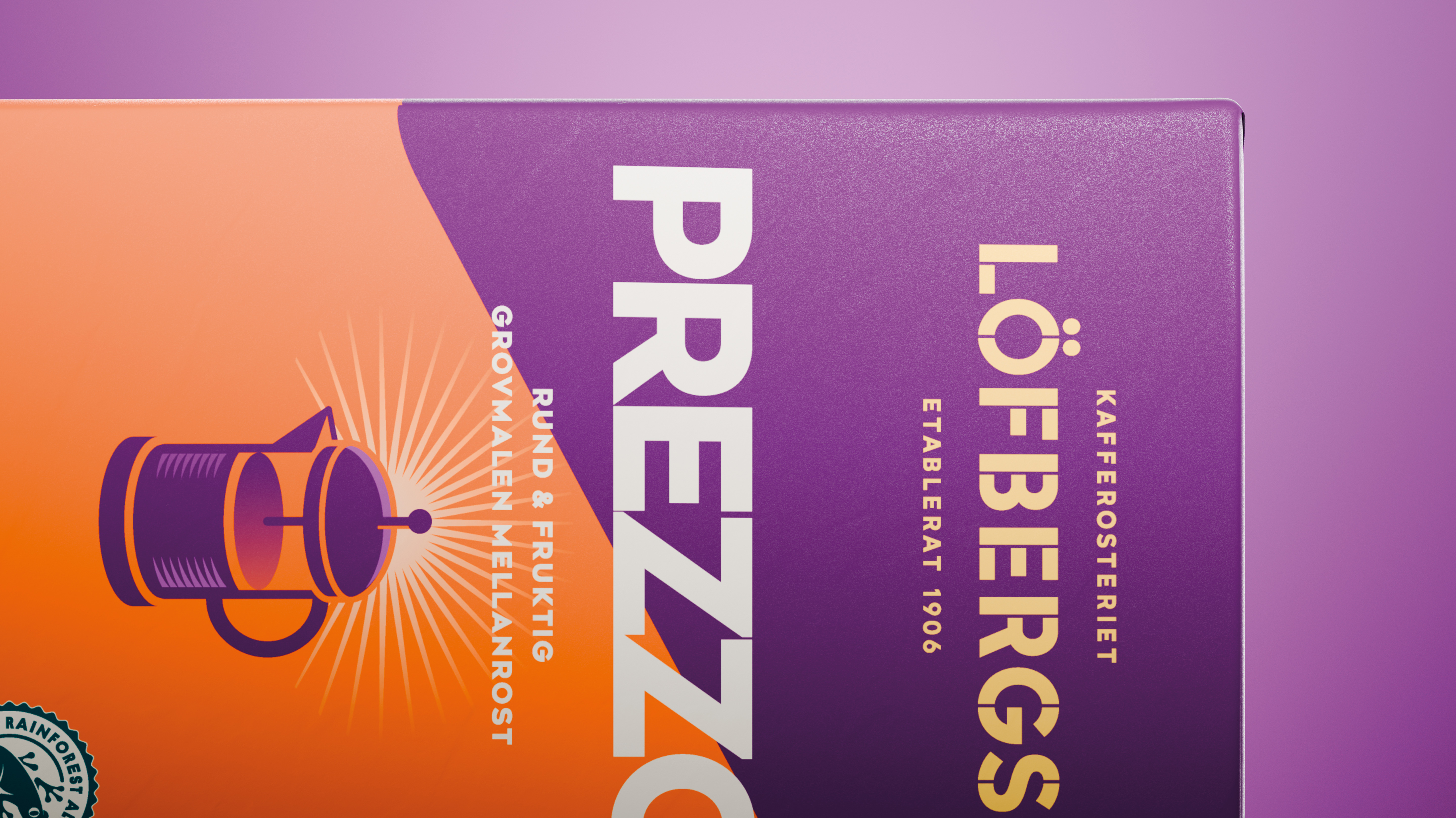
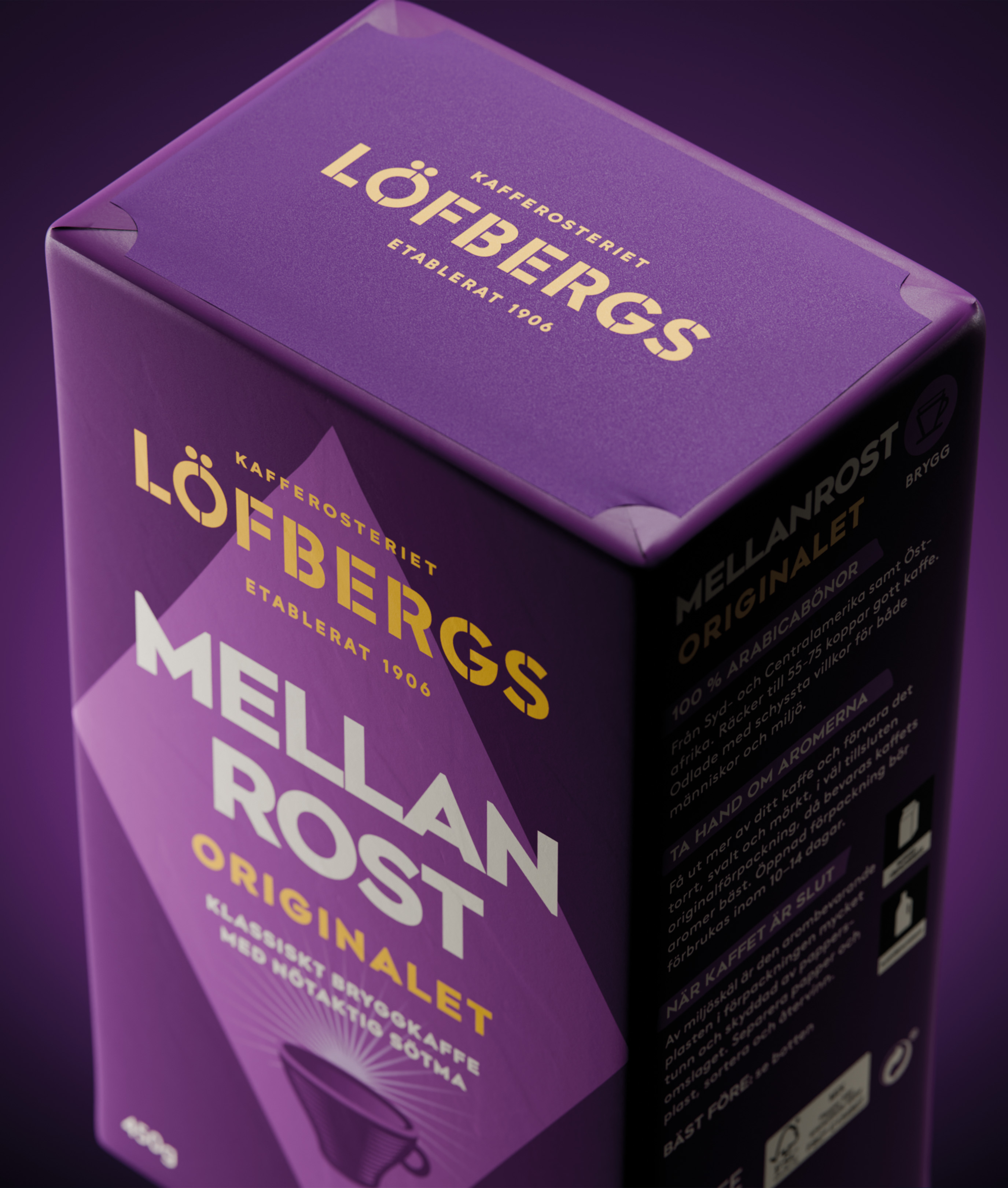
Key to the new look and feel was also to lift the brand itself, meaning taking true ownership of the Löfbergs purple colour, literally increasing the size of the logo and having it placed top in the hierarchy.
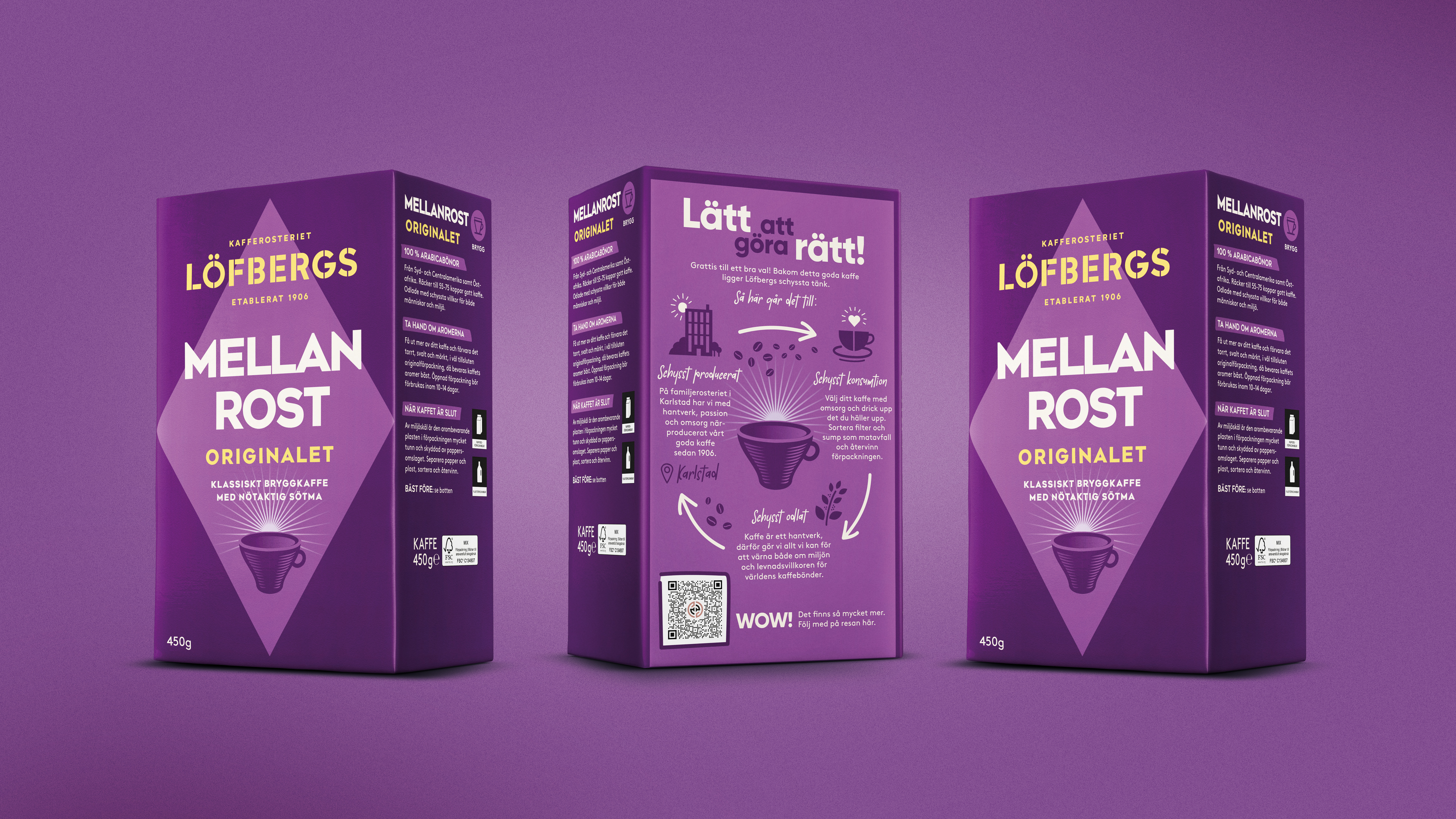

Equally essential was to convey Löfbergs great taste and their commitment to sustainability. To this end, we introduced an illustrated cup on the front and — more radically — introduced a storytelling back side of the paket. Never been done before! Here we elaborated on the great work done throughout the chain, and displayed a QR code to take the consumer even deeper into Löfbergs sustainability story. So now your coffee packet can truly come alive and show what’s beneath the bold new surface.

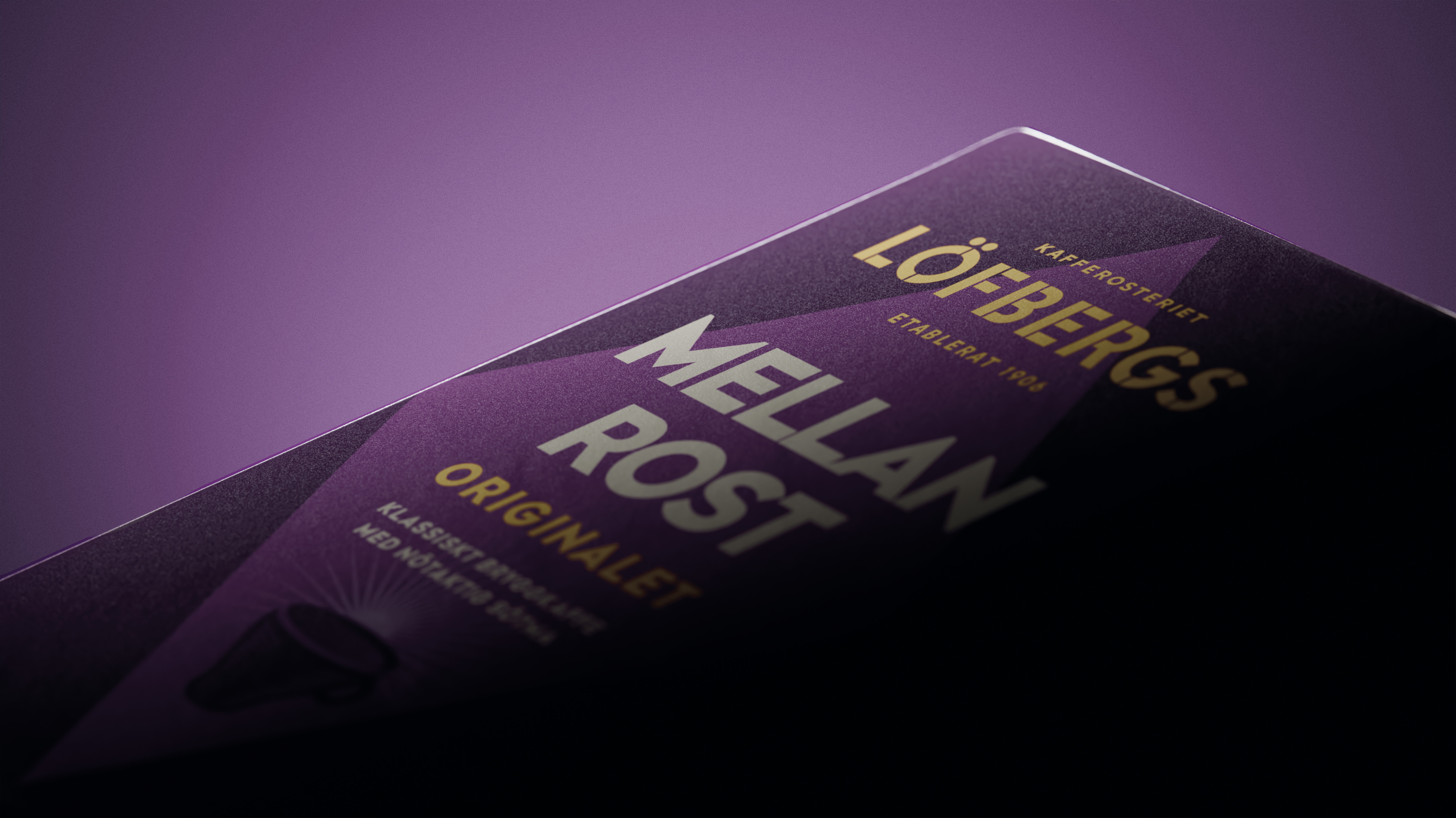
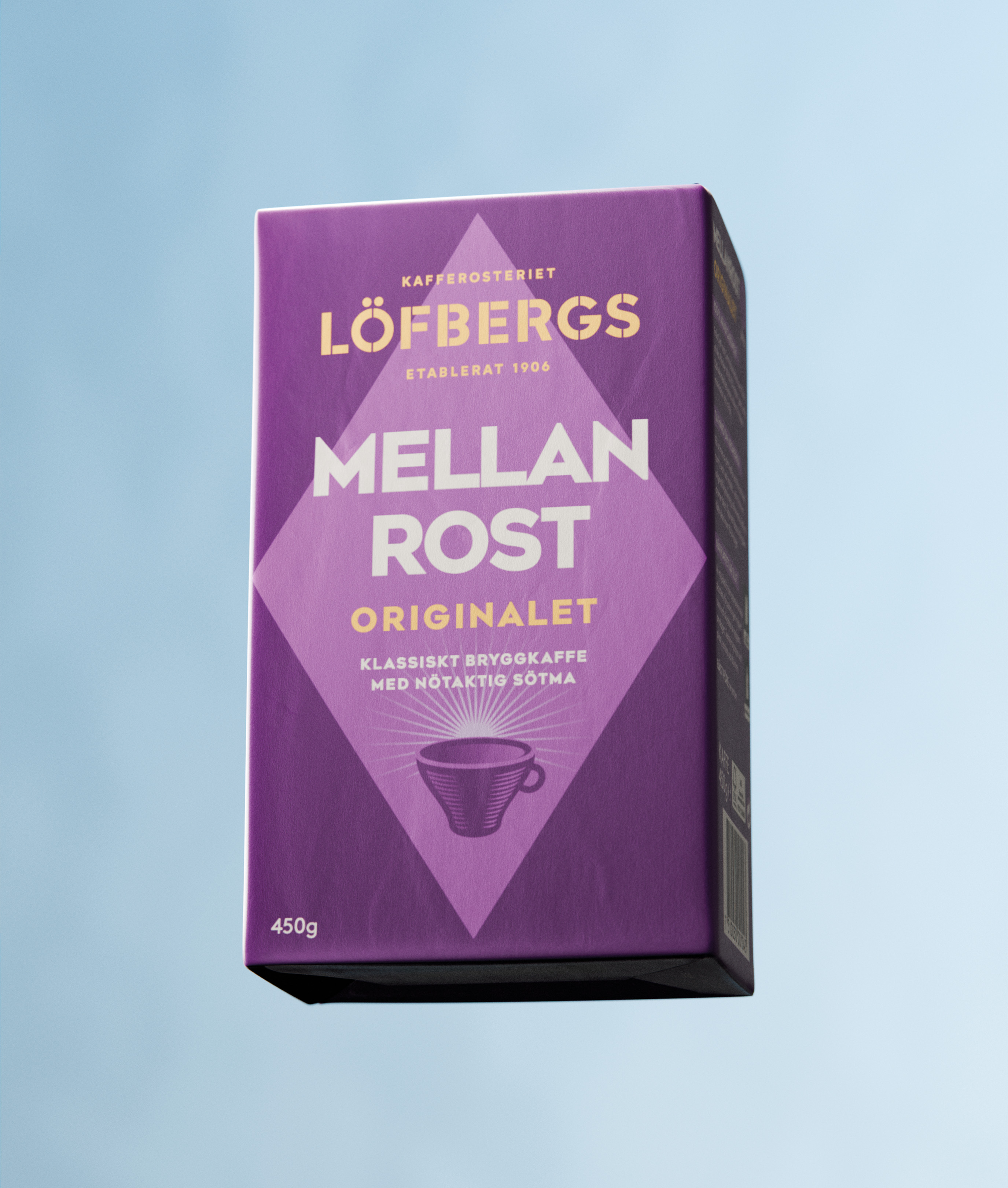
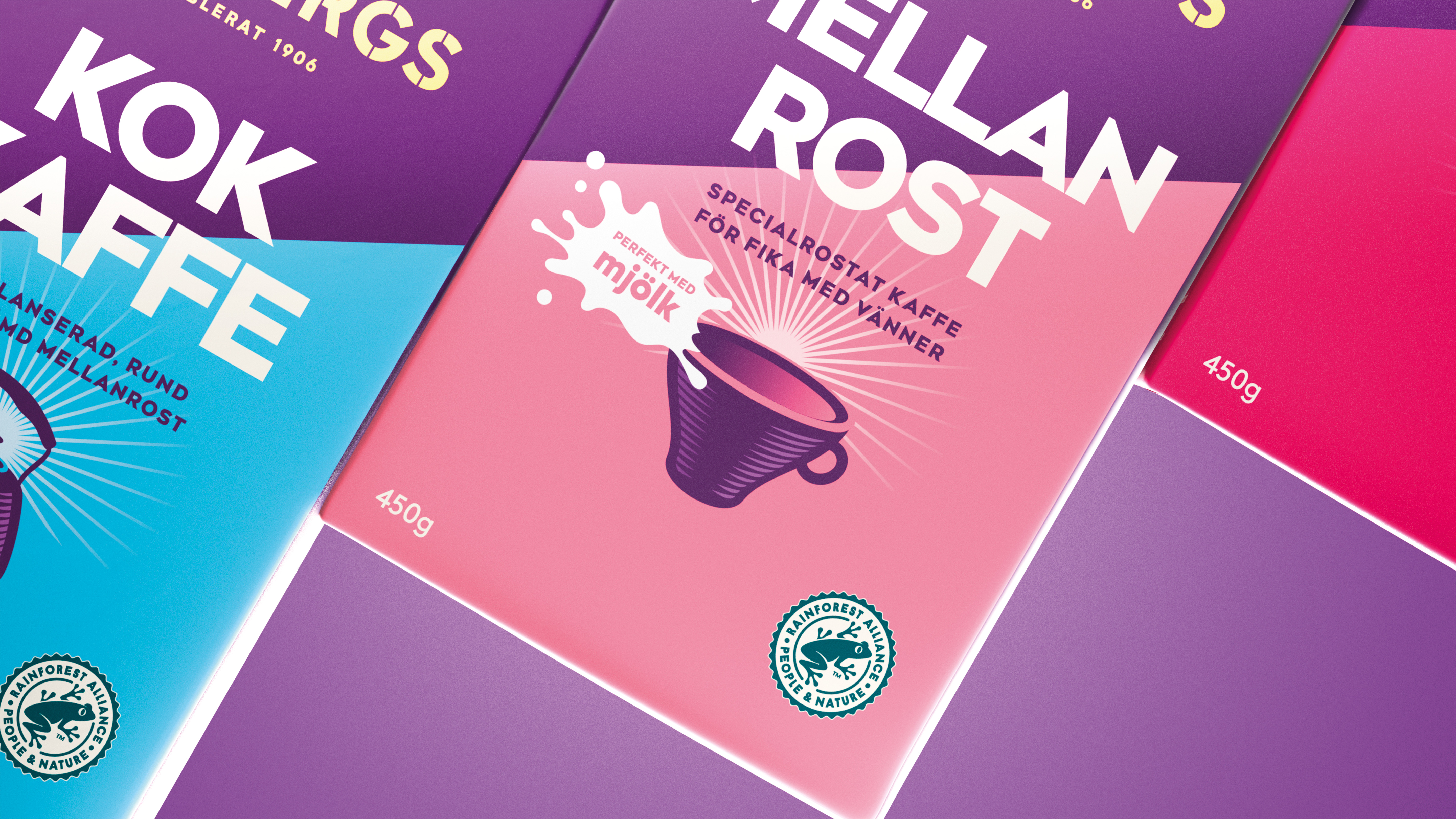
Löfbergs has always had colourful package designs, with the iconic medium roast “Mellanrost” in its purple livery a favourite since 100 years back. Paying respect to its iconic status, it was decided to lift this best-seller just a little from the crowd and give it a diamond shape — a nod to the packaging design from the 1920s.

Let’s create a beautiful storm together.
Start by saying “Hey!”
hey@goldstorm.se | +46 (0)703 059 718